How to choose the perfect city map poster
A practical guide to choosing the right city, crop, color palette, and words for a custom map poster that feels personal instead of generic.
Jun 3, 2026 / 6 min read / Guides / By Geoposter Studio
The best city map poster usually starts with a clear reason. It might be the city where you met, the neighborhood that became home, the campus you never stopped missing, or the trip that changed the shape of a year. When the place has a reason, every design choice becomes easier.
Start with the story, then choose the scale
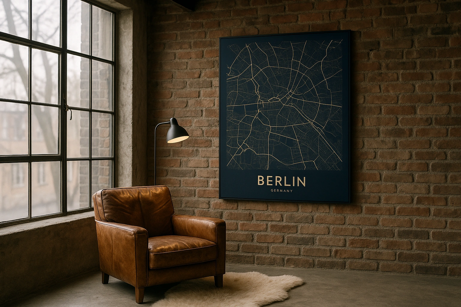
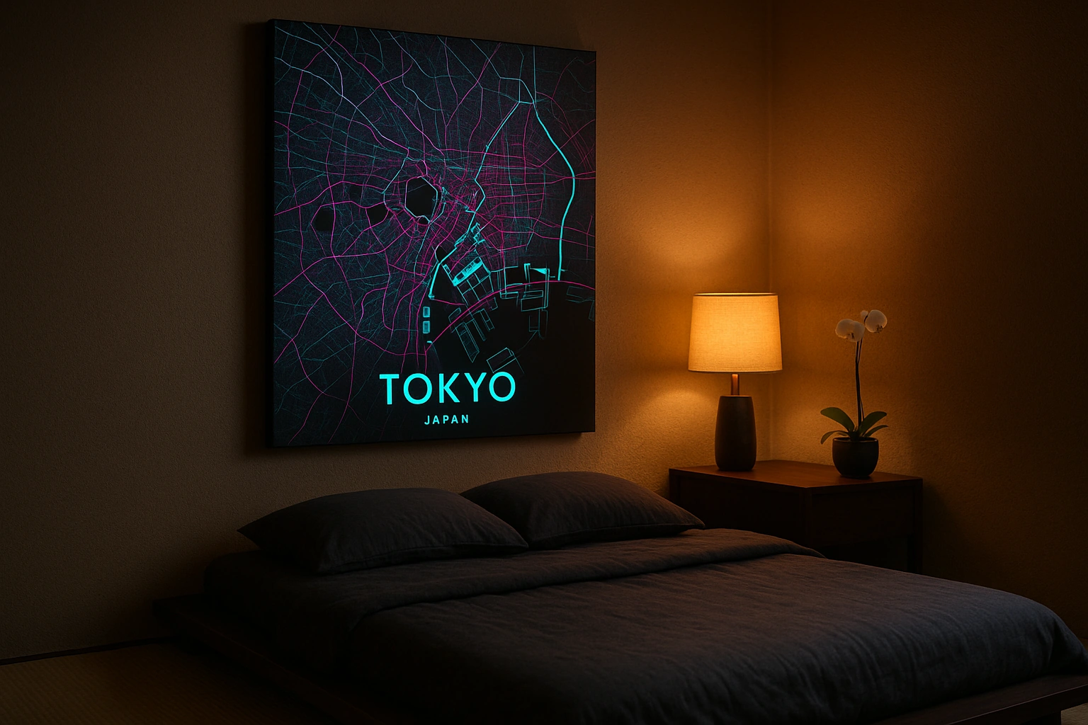
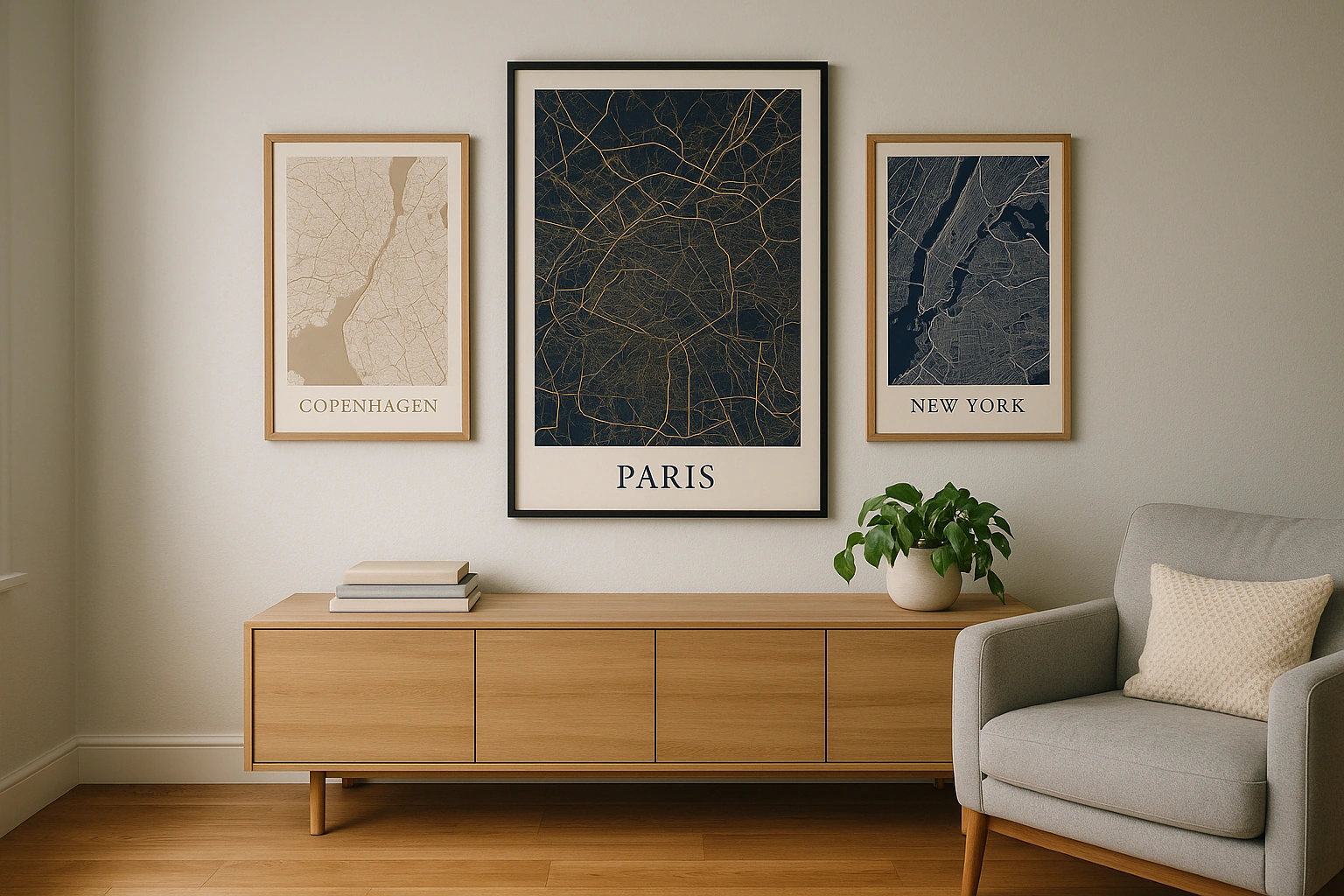
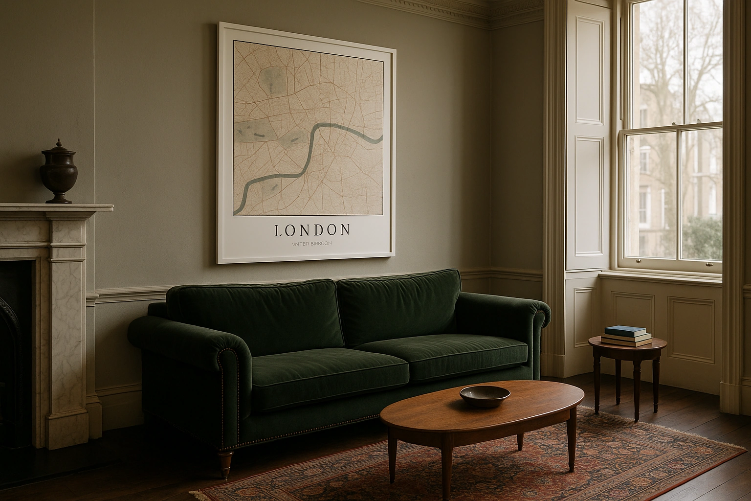
A whole-city view works well when the destination itself is the memory: Paris, New York, London, Rome, or Tokyo. A tighter neighborhood crop is better when the exact street matters, such as a wedding venue, a first apartment, or the block where a family story began.
If you can describe why the place matters in one sentence, you are already close to the right poster.
Color is the next big decision. Deep palettes feel dramatic in offices and living rooms, soft palettes suit bedrooms and nurseries, and high-contrast black-and-white maps are easiest to pair with existing frames. The goal is not to pick the loudest map, but the one that belongs in the room.
Make the words do real work
A title can be as simple as the city name, but the smaller line is where the poster becomes personal. Try a date, coordinates, a venue name, a family name, or a short phrase that only the recipient would understand.